Lorpon Labels leadership is always on the lookout for what’s working particularly well in the labels scene, so Jeff Sommer, VP Business Development and Murray Ditchburn, VP Sales, headed off to Ontario’s liquor store to see which spirits #OwnTheShelf. It’s a tough job, but somebody’s got to do it! Check out Murray’s selection in our two part series.
What Murray is looking for as he walks through the LCBO

Murray Ditchburn, VP Sales, Lorpon Labels
Spirits aren’t consumed as quickly as wine or beer, so the bottles and packaging will be on display in your home, almost as a piece of art. I want to see something that has a presence. I’m also more interested in small Canadian distilleries than large brands, but my eye is also drawn to products that have adjusted or enhanced their look without abandoning their brand recognition.
Murray selected 14 spirits that he feels #OwnTheShelf.
Number one
 Casamigos
Tequila can be a high bar for inexperienced drinkers but by using an earthy colour combination, an illustration of the source plant agave, and batch numbers, Casamigos has succeeded in making this spirit look accessible.
Number two
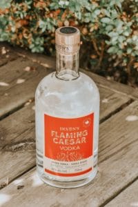 Dixon’s
All too often, the labelling on flavoured spirits makes the product look cheap. By pairing red with cream and using small-batch conventions, Dixon’s succeeds in making their Flaming Caesar vodka look like a craft offering.
Number three
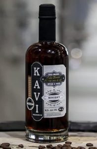 Kavi
Kavi
With an impressive diecut, screen printing, and embossing and debossing, Kavi’s label is eye-catching and luscious. Paired with a deep brown bottle, it manages to communicate its association with coffee.
Number four
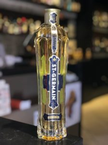 St. Germain
By looking at it, you’d think St. Germain was imported from Paris—in the 1930s. The elegant bottle shape, simple, vertical label, and restrained use of foil all make this a gorgeous and eye-popping package.
Number five
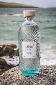 Isle of Harris
It’s a real trick to produce labelling for a bottle as unusual as this, but Isle of Harris pulls it off. A plain rectangular shape highlights, rather than detracts, from the vessel, while the appearance of flecks pulls the package together.
Number six
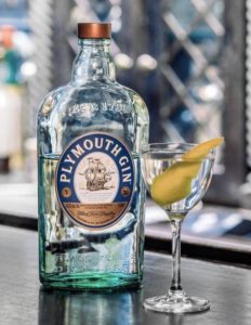 Plymouth
Plymouth is clearly going for an old-world feel, and everything from the illustration to the background pattern to the nice metallic colour contributes to the effect.
Number seven
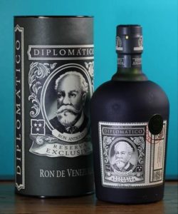 Diplomatico
This label has a lot of promise—it really stands out on the shelf. However, a gorgeous diecut on the edges would give it that premium look to align with the price point.
Number eight
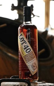 Lot 40
This bottle is a perfect example of how label positioning can take a good package to an eye-grabbing one.
Number nine
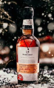 Barchef
Now for something completely different… By tucking a loose tag into the embossed label, Barchef has managed to create a premium look that really pushes the envelope.
Number ten
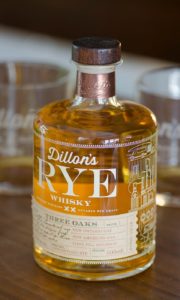 Dillion’s Rye Whiskey
This packaging has a craft look and the numbering gives it a limited edition feel, creating an element of scarcity and value. By silkscreening directly onto the bottle and adding a label, Dillon’s makes its rye whiskey seem timeless.
Number eleven
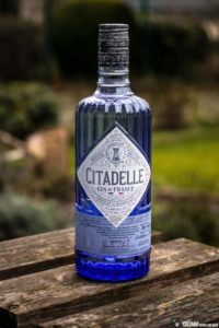 Citadelle
Even the most cursory glance will tell you that this product is from France. The labelling is very sharp, clean, and classic.
Number twelve
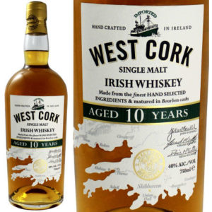 West Cork
With an amazing diecut in the shape of the emerald isle and the use of hot foil, this bottle jumps off the shelf!
Number thirteen
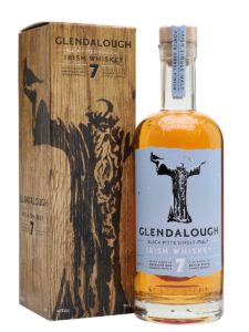 Glendalough
This is a major departure from the standard whiskey bottle. Using an embossed label with a unique diecut and font, Glendalough has managed to break the mold. It is impressive!
Number fourteen
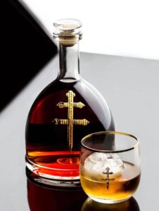 D’Usse VSOP
With an embossed variable data foil label, this bottle is more than vessel—it’s a statement piece. Without a brand name on the bottle, you’re left remembering the image first and foremost.
