Craft beer meets creative arts
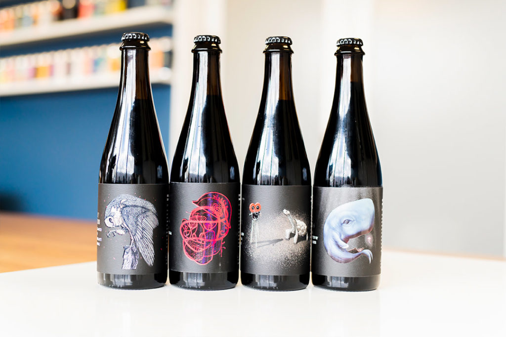
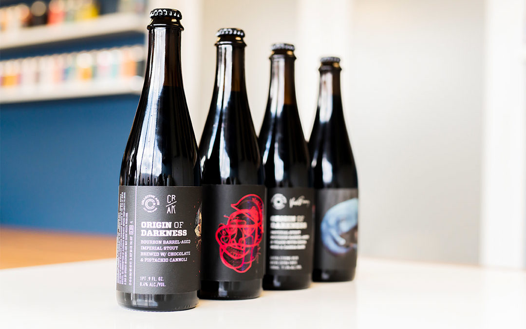
Based in Hamilton, Ontario, Collective Arts is a grassroots craft brewery that seeks to infuse as much creativity and craft into their packaging as they do their brew. For these brewers, that task may be more complicated than it seems. As the name suggests, Collective Arts has a strong connection with real, local artists—so much so that they collaborate directly. “We feature limited-edition works of art on our beer cans and labels,” explains Operations Coordinator Sarah King. “We work to make sure the liquid on the inside is as diverse and creative as the artists we profile.” Of course, this kind of commitment brings with it it’s own set of challenges. “Collective Arts is always trying to push the boundaries with our packaging,” says King, citing the brewery’s constantly rotating artwork. One such collaboration—a project featuring barrel-aged beers called Origin of Darkness—provided Lorpon Labels with plenty of room to show off their expertise.
Challenge
Production issues
The idea behind the Origin of Darkness project was to produce limited-edition, barrel-aged stouts in cooperation with other breweries and to package them with original artwork.
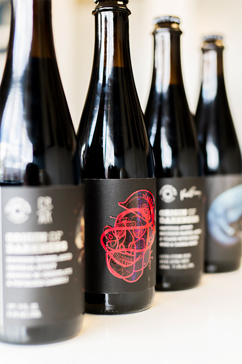
Due to the focus on art, the packaging would have to be premium, but even beyond that the Collective Arts team had a specific idea in mind for the labels. “We wanted multiple effects on the labels,” King explains. “Silver and varnish, and on a matte stock. It’s a lot to achieve.”
After they faced production issues in their first year, Collective Arts were looking to elevate the packaging. “We wanted to make sure the label series was going to pop.” That’s when they started working with Lorpon Labels.

Solution
After explaining their packaging concept, Collective Arts received a proof from Lorpon. “It was a full production proof with varnish,” King says. “You don’t always see that.” The higher-quality proof allowed the brewery team to really see the label come to life, ensuring it delivered the premium look they envisioned.
On Lorpon’s advice, Collective Arts switched to an Aquashield felt stock which was superior for both its nice texture and moisture-resistant qualities. The Aquashield properties of the paper allow the brand imagery to not be compromised by any exposure to water. They also improved; the previous metallic effect with a premium hot stamped metallic foil and also added a tactile gloss high build varnish.
Adding another level of complexity to the Origin of Darkness project, Collective Arts’ barrel-aged Imperial Porter was packaged in a beautiful gift tube along with an art print. Although the Porter label was printed by a different supplier, the Collective Arts team wanted to make sure there was a sense of symmetry across the entire series. “In terms of the level of confidence and execution, Lorpon was the only supplier able to help us meet that goal.”
Result
When the labels were produced, the Collective Arts team were more than satisfied. “The goal was to elevate the product and we achieved that,” King remarks. “Having the heavier stock really made the product feel much more high-end. The labels came out beautifully, the colours popped, there was a high definition. The black, which is the majority of the label, was a great colour. And we were very, very impressed with the level of detail on the graphics.”

Even better? All this was accomplished at the right price. “We really make sure there’s a focus on art so we’re always looking for suppliers that are driving that competitive edge as well,” King says.
