Feeling the heat in today’s cutthroat market? You’re not alone. With consumers becoming more discerning and demanding, it’s time to step up your game. Let’s talk about why splurging a bit on premium labels can be your secret weapon in dominating the shelf space.
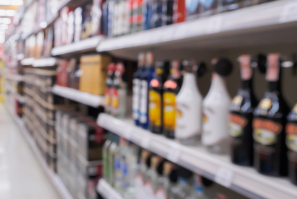
Picture this: you’re strolling through the aisles of your favourite store, scanning the shelves packed with products of all shapes and sizes. What’s the first thing that catches your eye? More often than not, it’s the labels. In an era defined by the Zero Moment of Truth (ZMOT), where purchasing decisions are made in the blink of an eye, having eye-catching labels is no longer a luxury but a necessity.

At Lorpon Labels, we make it our mission to keep a close eye on what’s hot in the labelling world. Recently, Jeff Sommer, our VP of Business Development, took up the challenge of checking out stores to find labels that really stand out on the shelf. It’s no walk in the park, but hey, someone’s gotta do it!
Jeff’s criteria for selecting labels revolve around the ZMOT concept. Each label he handpicked embodies elements that catch the eye and leave a lasting impression on potential customers. Here are six labels that Jeff believes exemplify what it takes to stand out on the shelf:
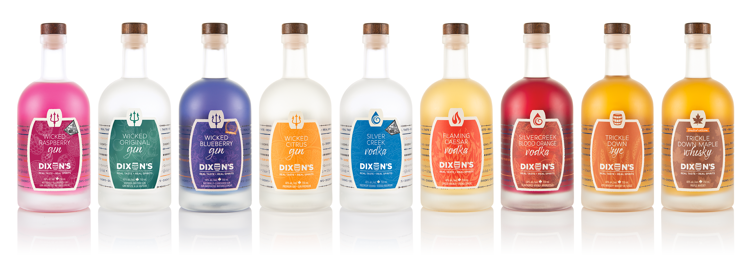
Number 1 Spirits
Dixon’s multi-level effect labels, created using Jetfx technology and a blend of low and high build techniques, redefine sophistication. Dixons sets itself apart with customization options at no extra cost, offering consumers a unique experience tailored to each product variant.
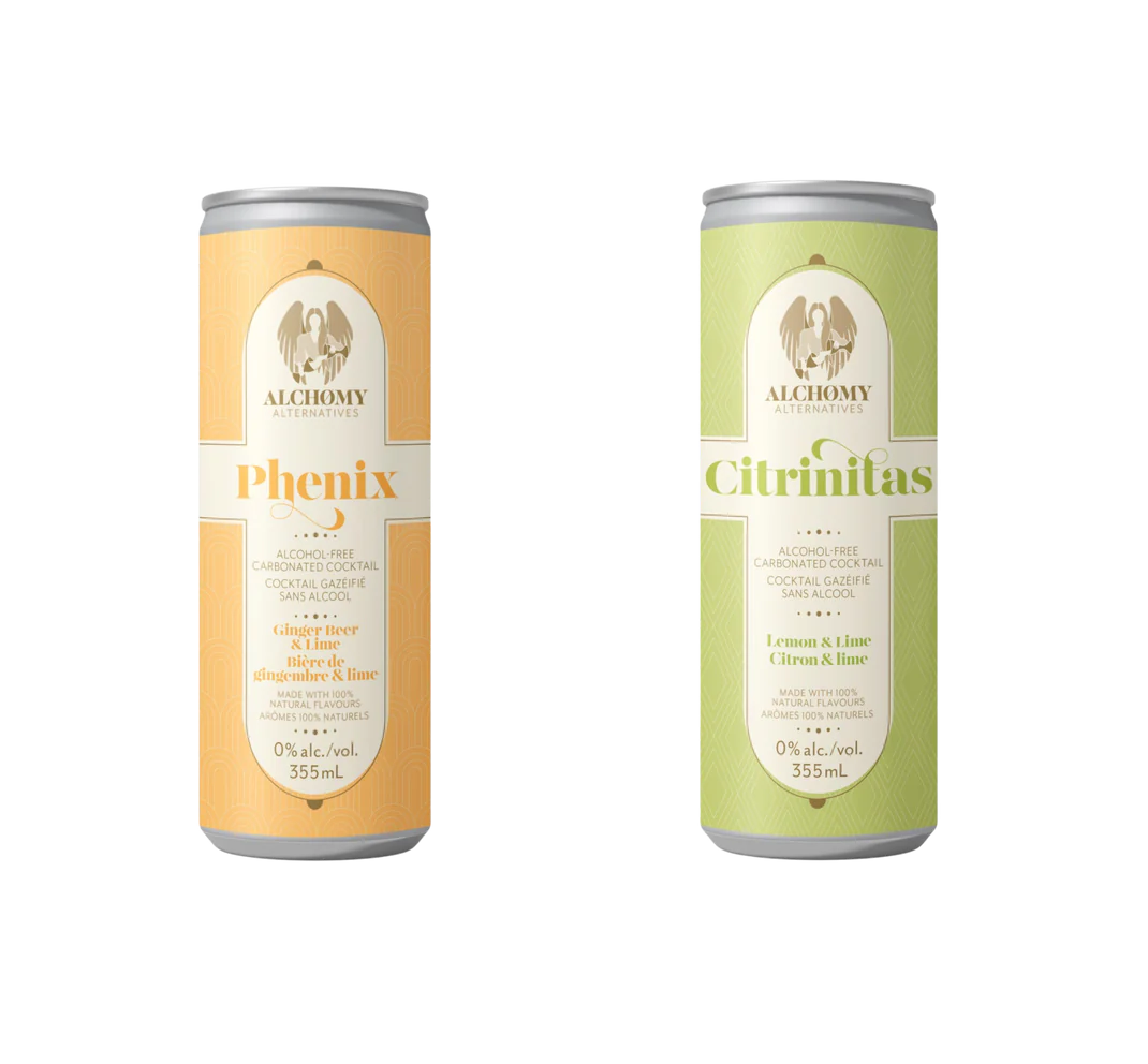
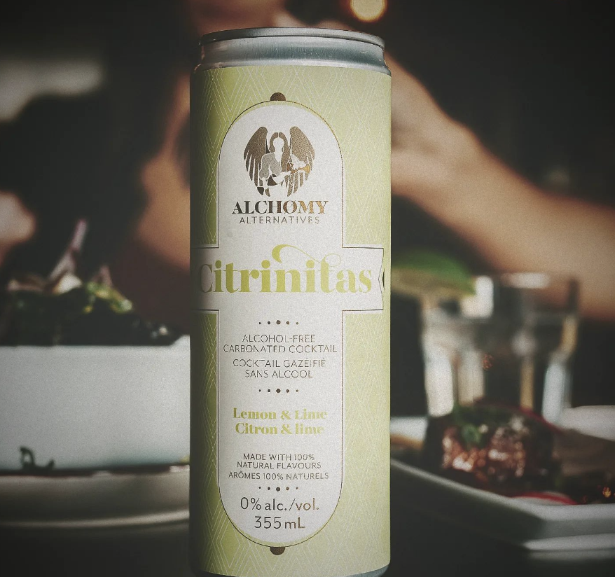
Number 2 Beverage
Alchomy Alternative’s velvet soft-touch labels exude sophistication and luxury. These labels elevate the brand’s image and create a tactile experience that resonates with discerning consumers, setting Alchomy Alternative apart in a crowded market.
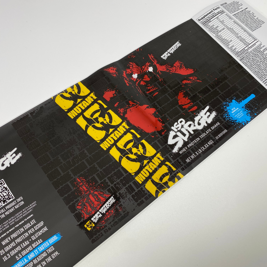
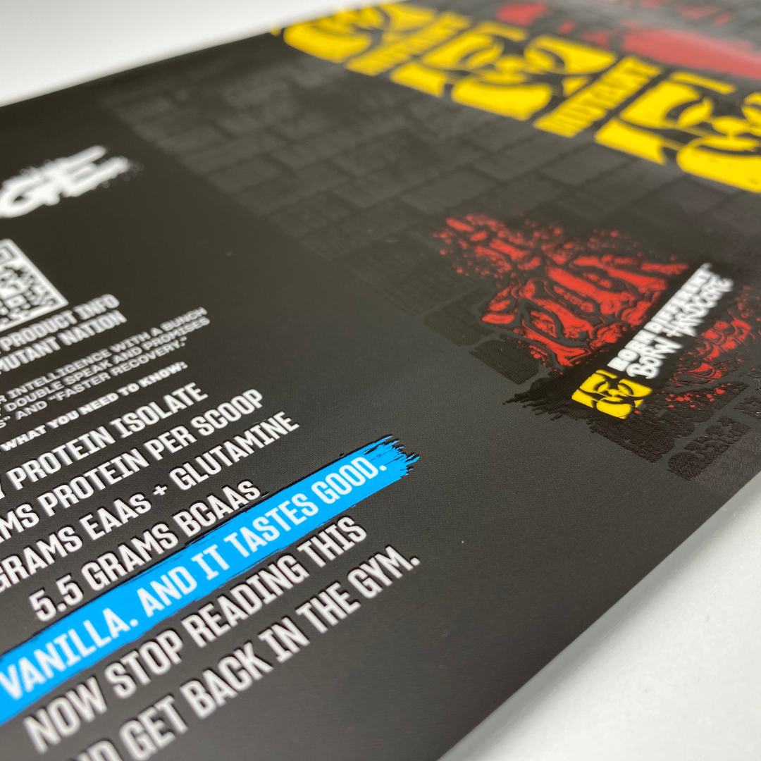
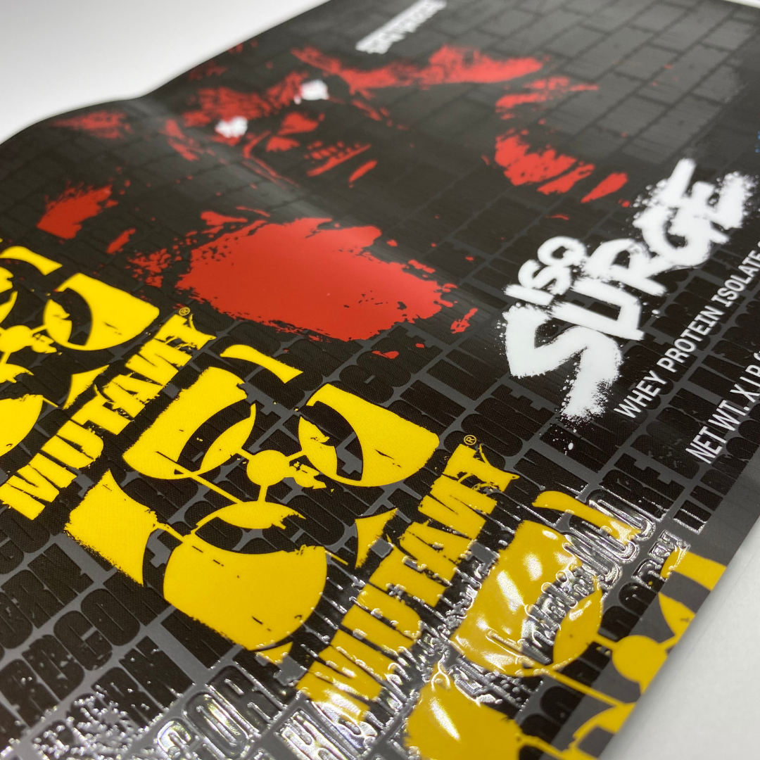
Number 3 Sports Nutrition
Mutant’s metallic Bopp label is a game-changer in the quest to own the shelf. By ingeniously leveraging foil accents, Mutant creates a label that commands attention and dominates the shelf space. With meticulous Red CYMK application on the foil, vibrant hues come to life, enhancing the label’s visual impact. Yellow and blue were added on top of a white layer, adding depth to elevate the design further, creating a dynamic interplay of colours that ensures Mutant’s products shine brightly amidst the competition.
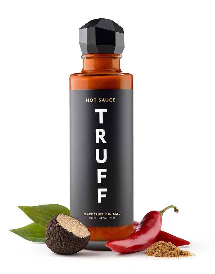
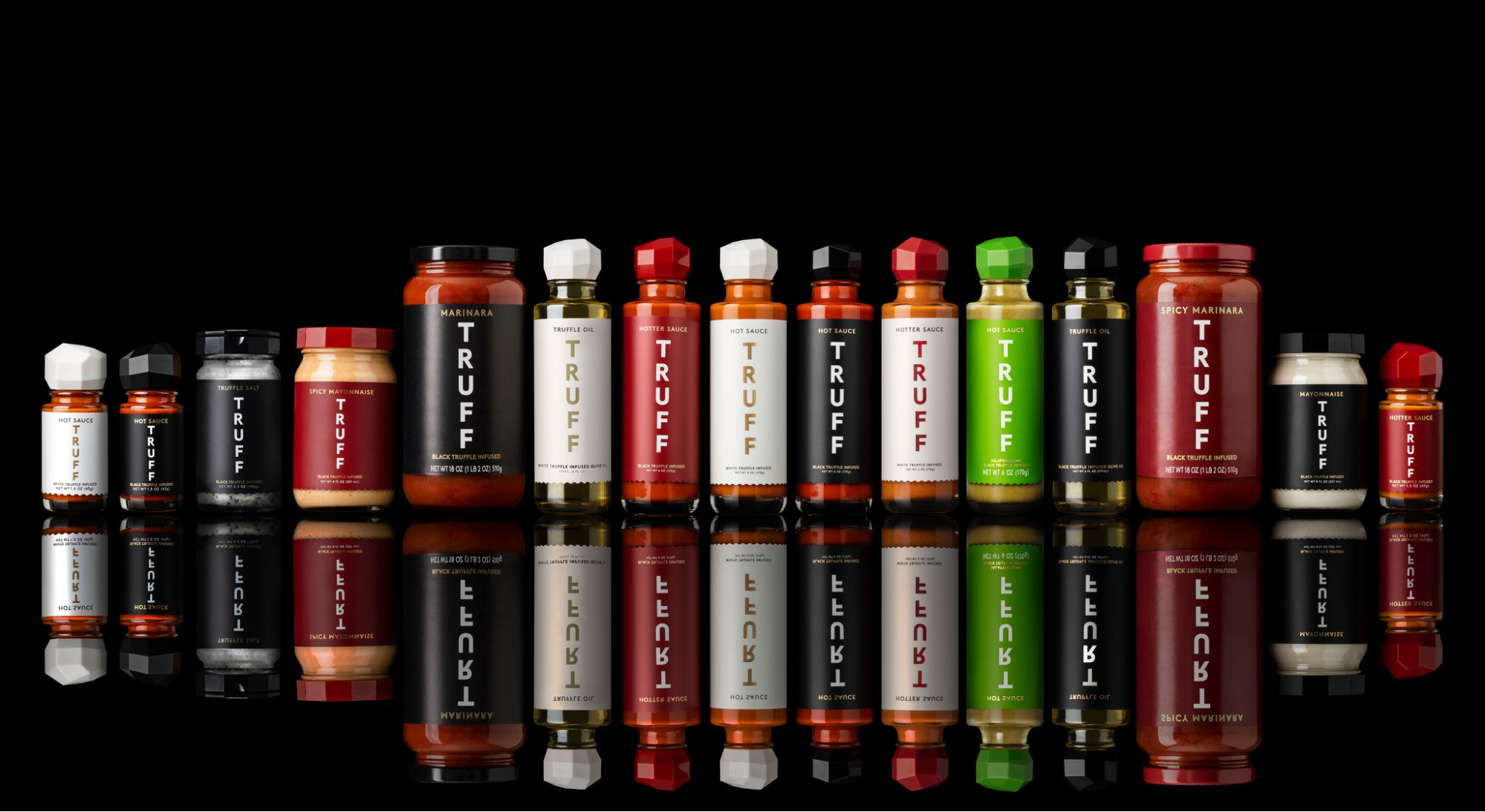
Number 4 Food
Truff’s sauce labels are a harmonious black-and-white print blend with hot foil accents. In a sea of sauce labels, Truff stands out, commanding attention and enticing buyers with its premium allure.
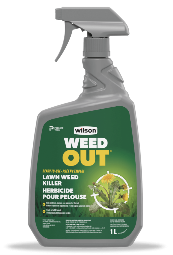
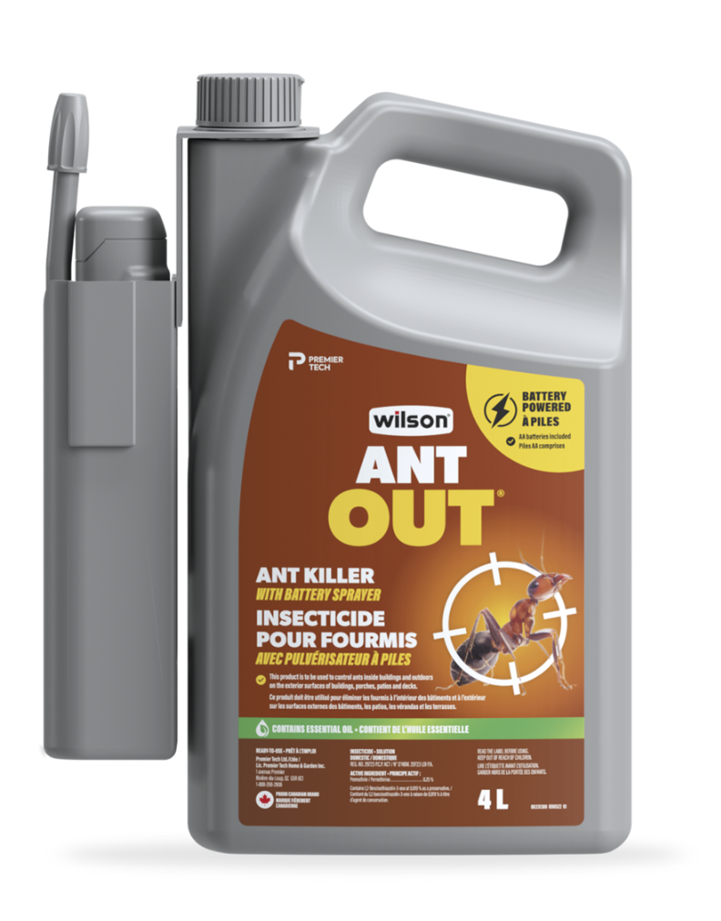
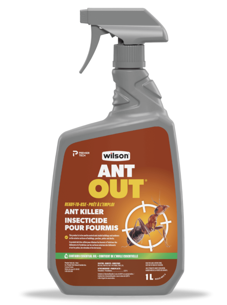
Number 5 Chemical
Wilson’s ANTOUT and WEEDOUT labels feature a seamless fusion of functionality and elegance. Crafted with white BOPP and enhanced by HP Indigo technology, these labels boast anti-scuff gloss varnish, ensuring durability against outdoor elements. Powered by fade-resistant digital inks, they maintain their pristine appearance even when stored outside or in garden centers. In a market filled with a dizzying array of choice, Wilson’s s labels command attention, offering both practicality and sophistication to discerning consumers.
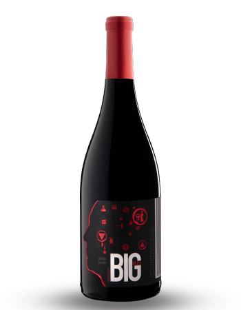
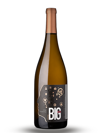
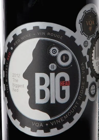
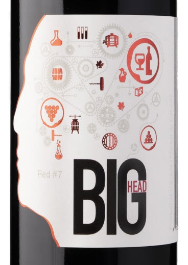
Number 6 Wine
Big Head Wines labels strike the perfect balance between innovation and sophistication. With special die-cutting and hot foil accents, they add a touch of luxury. Enhanced with high and low build elements, these labels offer a unique tactile experience. Designed with attention to detail, they stand out in the wine market, appealing to consumers with their blend of style and practicality.
Each of these labels showcases the design possibilities and underscores Lorpon’s ability to think outside the box and bring imagination to life. From personal care to food, beverage and chemicals, Lorpon empowers brands to make a statement on the shelf and win over customers at the Zero Moment of Truth. Don’t settle for ordinary labels—partner with Lorpon and let your products #OwnTheShelf!